
Mobile friendly optimisation
As you may already know, Google started rolling out mobile-first indexing earlier this year. But what does that mean for your ranking? Should you be worried? Should you do anything? We’ll talk you through five things you need to know about mobile-first indexing.
Mobile-first indexing
Last March, Google announced that they were going to start with mobile-first indexing. But what does that entail? It means that from now on, Google will base what it places in the index based on the mobile version of your site, whereas they used to index the desktop version of your site first. This switch is made because more and more searches come from a mobile device and to give those users a better experience, Google decided that it was time to prioritise mobile results. It is important to note that the mobile-first index is not a separate index, Google has only one index from which it serves the results.
1. No need panic!
Of more and more sites the mobile version will be indexed. That does not mean that anything big is happening. In fact, it probably doesn’t do anything to your rankings.
If Google indexes the mobile version of your site, you’ll get a notice in your Google Search Console. This means that Google will determine by the content available on your mobile site how you will rank — both on the desktop as well as on mobile. This sounds pretty big, but for most WordPress sites it’ll have minimal consequences. If you think about it, most WordPress sites have a responsive design. This means that both mobile and desktop display the same content. You’ll have nothing to worry about in this case.
If you have different websites for mobile and desktop and your mobile website has far less content – you do have something to worry about.
2. Run a mobile friendliness test. Ranking without mobile is going to be hard…
You do not have to have a mobile site to be in the mobile-first indexing, as Google will index desktop sites as well. But, it’s going to be hard to rank if your site is not mobile friendly. Mobile friendly design is an ever increasing part of good SEO. So there’s work to do for all of you who do not have a mobile friendly site yet.
So what do you need to do? Check out Google’s mobile friendliness test and check whether or not your site is mobile friendly. In our experience, this is a minimum requirement. If your site does not pass this test, your mobile version is bad.
3. Think about User Experience (UX) on mobile
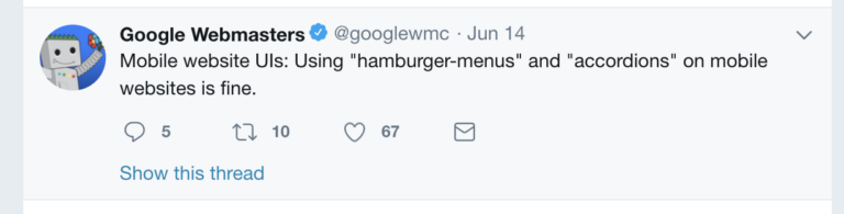
A mobile website needs a different design than a desktop version to appeal to your audience. Your screen is tiny. Google explained that hamburger or accordion menus are perfectly fine to use. These kinds of menus make sense; they help a mobile user to browse through your website. Putting content behind a tab to make the mobile experience better is also totally fine.
4. Write mobile-friendly copy
Reading from a screen is hard. And reading from a mobile screen is even harder than reading from a big screen. To attract a mobile audience, you’ll need to have mobile-friendly copy. This means short sentences and compact paragraphs. You need to make sure your font on your mobile site is large and clear enough, and you need to make sure to use enough whitespaces.
5. Check your mobile snippets
Is your audience mainly mobile? Do they come from the mobile search results to your page? Or does most of your organic traffic come from the desktop SERPs? Make sure to check this in your Google Analytics.
If your search traffic is mostly from mobile Search Result Pages, make sure to optimise your mobile snippets.
Don’t panic about the mobile-first index Google is rolling out. If your website has a responsive design, your content will be similar on both desktop and mobile versions. If so, the mobile-first indexing will have little consequences for your ranking.
Do take some time to evaluate the mobile version of your website. Check out its mobile parity — are your desktop and mobile site equal? Is your design good enough? Or could you improve? Are the buttons large enough to tap? What about your content? Could you make your text more readable for a mobile audience? Making sure your website has a kick-ass mobile experience is something you need to get started on. This will make a difference in your rankings shortly.
[Sassy_Social_Share title=”Sharing is Caring”]